Color design plays a crucial role in interior design by setting the tone, creating visual contrast, and providing artistic pleasure. The first impression of a space is formed within the first few seconds of entering it, with 75 percent of this perception being based on the perception of color, even before the whole form is understood.
The RAL color card is a widely used color tool in industrial applications. It enables professionals in the fields of interior architecture, design, and product design to present color schemes perfectly and precisely, resulting in an unparalleled effect and expressiveness in their design work.
RAL is the industry standard color system that enables interior architects, designers, and product designers to quickly select a coherent color.
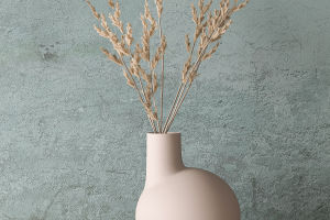
RAL colors allow for monochromatic balance and lightness gradients in a three-dimensional color space. The hue and chroma values of the colors remain constant, while the lightness values vary by equal distances in the RAL design system plus. This is a unique and eye-catching solution for a group of storage units.
Similar colors in harmony are found next to each other in the color ring, such as red, orange, and yellow. When creating a similar color scheme, one color can dominate others.
In the field of business, a similar color scheme is not only pleasing to the eye, but it can also be an effective guide to help decide where and how consumers should act.
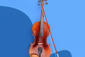
Complementary colors work in harmony as well. Complementary and similar colors are similar in that the lightness and color values of the colors remain the same, but the difference lies in the wide range of hue values.
Strong contrasts between the colors can make a scheme more stylish, such as in the case of many shopping center decorative colors. The use of complementary color schemes in commercial marketing can provide sharp contrasts and clear differentiation.
The RAL design system plus allows designers to achieve color-no-color harmonies, color gradients, and much more.
As a modern, scientific color system, designers can present color schemes to their clients with a professional color theoretical basis.
During the design process, RAL colors act as a navigator to help designers find the desired color range easily and quickly, and then to find the required colors according to the respective target groups and project requirements to realize individual designs.
At the same time, the RAL system ensures that the colors are accurately reproduced at all stages of production.
In addition to interior design, the use of color is also essential in various fields such as fashion, graphic design, and advertising. It has been found that color has a significant impact on human emotions and behavior, which is why it is crucial to choose the right color scheme for a particular purpose.
For example, warm colors such as red, orange, and yellow can create a sense of energy and excitement, while cool colors such as blue, green, and purple can create a calming and relaxing atmosphere. The use of color is a powerful tool that can influence the way people feel and behave in various situations.
Color design is a crucial aspect of interior design, and the RAL color card provides a valuable tool for designers to achieve the desired effect and expressiveness in their designs.
The RAL design system plus allows for monochromatic balance and lightness gradients, similar colors in harmony, complementary colors in harmony, color-no-color harmonies, color gradients, and much more.
It is a modern, scientific color system that helps designers present color schemes to their clients with a professional color theoretical basis and ensures that colors are accurately reproduced at all stages of production.